Turning Trust into Conversions
A Digital Makeover for a Referral-Driven Law Firm
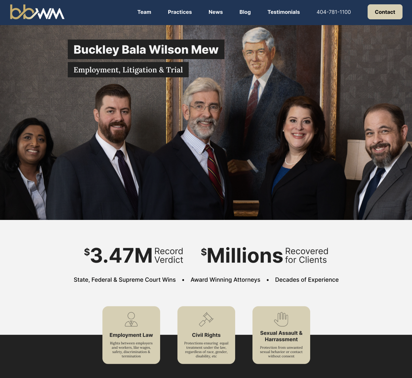
BBWM is a boutique law firm that relied on word of mouth referrals for new clients. While referrals brought in strong business, their website was not contributing effectively, it generated mostly poor quality leads that rarely converted. BBWM asked Product on Point to redesign their website’s messaging and user experience to attract higher quality leads and replicate the trust of referrals in an online format.
“Our firm retained Product On Point to review our website and help us to step up our search engine optimization (SEO) . We were thrilled with Narain Bala’s input and he absolutely helped us jump to the next level. Narain’s expertise is the kind you don’t know you need until you ask for his help. Then you wonder how you ever did without him. He did a deep dive on all of our metrics and came up with some surprising and mostly simple adjustments that had immediate positive results.
Our website is more attractive now too! I would be happy to recommend Product On Point to any business that wants to optimize its SEO. He has made an invaluable contribution to our firm’s marketing efforts.”
Edward D. Buckley
Managing Partner | Buckley Bala Wilson Mew
THE INTRODUCTION
Buckley Bala Wilson Mew LLP (BBWM) is a prestigious law firm known for its exceptional legal services
THE PROBLEM
Despite its reputation, BBWM's website faced challenges in effectively engaging visitors and converting them into leads. To address this, Product On Point proposed a comprehensive strategy to enhance BBWM's website by simplifying navigation, improving user experience, and enriching storytelling.
THE SOLUTION
We partnered with BBWM to overhaul their online presence with a focus on clarity, trust, and performance. Our team implemented several key design and technical improvements:
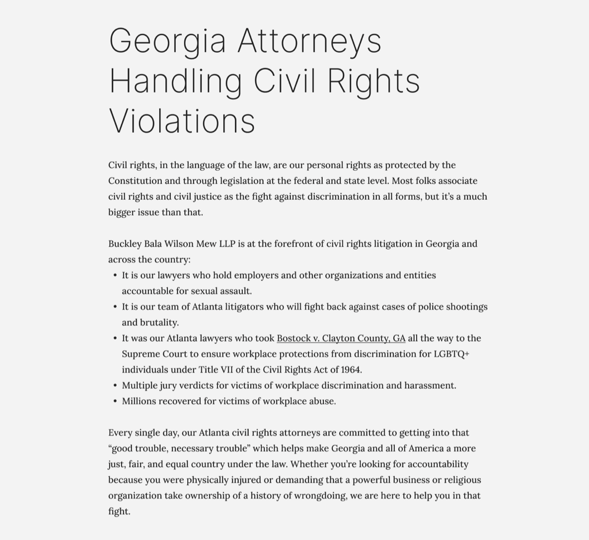
Messaging & Storytelling: We rewrote the website copy to clearly communicate BBWM’s value proposition and expertise. We introduced strong storytelling elements, including case examples and client narratives, to better resonate with potential clients.
Visual Design: We refreshed the site’s look with a neutral background palette and enhanced typography for improved readability, giving a modern, professional feel. We also featured BBWM’s legal team prominently with professional photos and bios, putting faces to the firm to build trust with visitors.
User Experience & Accessibility: We restructured the site for intuitive navigation, making it easy for visitors to find relevant information and contact BBWM. The redesign followed accessibility best practices (improved color contrast, alt text for images, keyboard navigation support) so that all users could comfortably use the site.
Performance Optimization: We conducted a comprehensive audit and developed a detailed set of recommendations to improve site speed, code hygiene, and overall technical performance. These included guidelines for image optimization, code minification, accessibility enhancements, and responsive behavior. While we delivered the strategic roadmap and specifications, BBWM’s internal IT partner is responsible for executing these improvements during the final implementation phase.







“We worked with Narain and his team to improve usability of a law firm’s website. His deep knowledge and extensive experience were evident throughout the project. We couldn’t be happier with the results and highly recommend Narain and his company.”
Stephanie Manor Chew
Director of Sales | Digital Law Marketing.
Our Work
Our studio’s leadership has the track record to take your business to the next level.
Outcome
As part of our engagement, Product On Point delivered a strategic redesign and a clear set of performance-focused recommendations to help BBWM improve lead generation through their digital presence. While our studio completed the UX, design, and messaging overhaul, technical implementation was handed off to BBWM’s internal IT partner for final deployment and performance optimization.
We identified three primary metrics of focus for BBWM’s success and provided corresponding industry standard SLAs based on benchmarks for lead generation websites in the legal services space:
Higher Engagement
Metric Focus: Reduce bounce rate and increase time on site
Recommended SLA: Bounce rate below 50%; average session duration above 1.5 minutes
We redesigned the information architecture and storytelling flow to keep visitors engaged and make it easier to find key service information quickly.Better Leads
Metric Focus: Increase in qualified contact form submissions
Recommended SLA: At least 10 - 15 qualified inquiries per month from target audience segments
Our content and messaging strategy was built around BBWM’s core differentiators, with prominent CTAs and trust-building content to attract clients aligned with their practice areas.Improved Performance
Metric Focus: Page speed, accessibility, and cross-device usability
Recommended SLA: Page load time under 2 seconds; 90+ Lighthouse scores for Performance and Accessibility
We provided BBWM with technical specs and optimization guidelines (image compression, code best practices, accessibility compliance) for their IT partner to implement.
By combining design best practices with a measurable SLA framework, BBWM now has a clear roadmap to elevate their digital experience, and turn their website into a credible source of high quality leads.
Contact us.
Let's initiate a conversation about your unique needs. We're all ears and ready to lend our expertise to bring your vision to life!


